How do I build out a sick design from a totally blank page?
So I've got a whole-ass stack of design questions sitting in a Notion document, and I figured it'd be a cool mini series to go through some of them and share some design tips with ya! I'm a major design nerd, I LOVE talking about this shit and breaking it down into hopefully more realistic, usable prompts & ways of thinking, so let's get into it. 😊
First up —
"How do I build out a sick design from a totally blank page??"
You gotta start with the basics.
Yes, there's loads of designy tips and tutorials and visual stuff I can & will show you, but we can't really start there because first comes the foundational shit. 👉
There's TWO things I want you to ask yourself when you're designing anything, from websites to posters to social media graphics, and everything in-between —
What’s the goal? Aka what is it? e.g. A simple but super fun & bold email graphic for a new product you’re launching.
Where is it going, and what can that tell us about the design? e.g. In an email. So that tells us it needs to be a small-ish graphic, not too tall, focusing on big copy, with minimal to zero small text (because that should be in the email itself as text, you never want to include big pieces of text as images, for responsiveness & accessibility). Otherwise the imagery and design can be playful and fun, and bold. And of course, it should be on brand because this is going out to your existing audience, and we can use design to make help people pay attention.
For a piece of design to be functional, you have to know those two things — the goal and where it’s going. This is where design starts to differ from just art. And, where the foundation for really fucking good design starts.
From there you can make it look cool and mess around with layouts & designs and do all the fun stuff. But you always want to come back to those two things, the goal and where it’s going.
If you’re not intentional about this stuff, then it’s likely your design will fall flat, or it’ll be a visual shit show because you’re not taking into consideration HOW and WHERE people are going to be seeing it... Which is a majorly important piece of creating designs that not only look & feel fresh in comparison to everything else out there, but they actually connect with people and give you real, actual results.
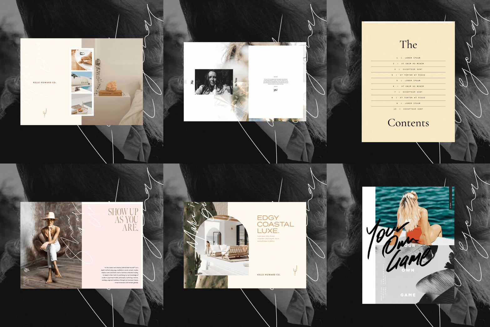
Design is problem solving, and presenting information in ways that make people want to give a fuck. Yes, it's also self-expression, but it's so much deeper than just making things look pretty. It's visual communication, as an art form, so you can design rad stuff like this... 👉

