
I can't stop thinking about this one branding move.
So I've been keeping my eye out for really sick design a lot more than usual lately, since I'm bringing a lot of shit into my course Layout Legends, to talk about what actually makes good design and what I think some brands are doing really well, and there's something I've been noticing a bit lately that I absolutely LOVE, so I wanted to talk about it more here with you too.
And that's single colour branding.
Aka, where a brand makes a very conscious choice to only use ONE SINGLE brand colour across the board.
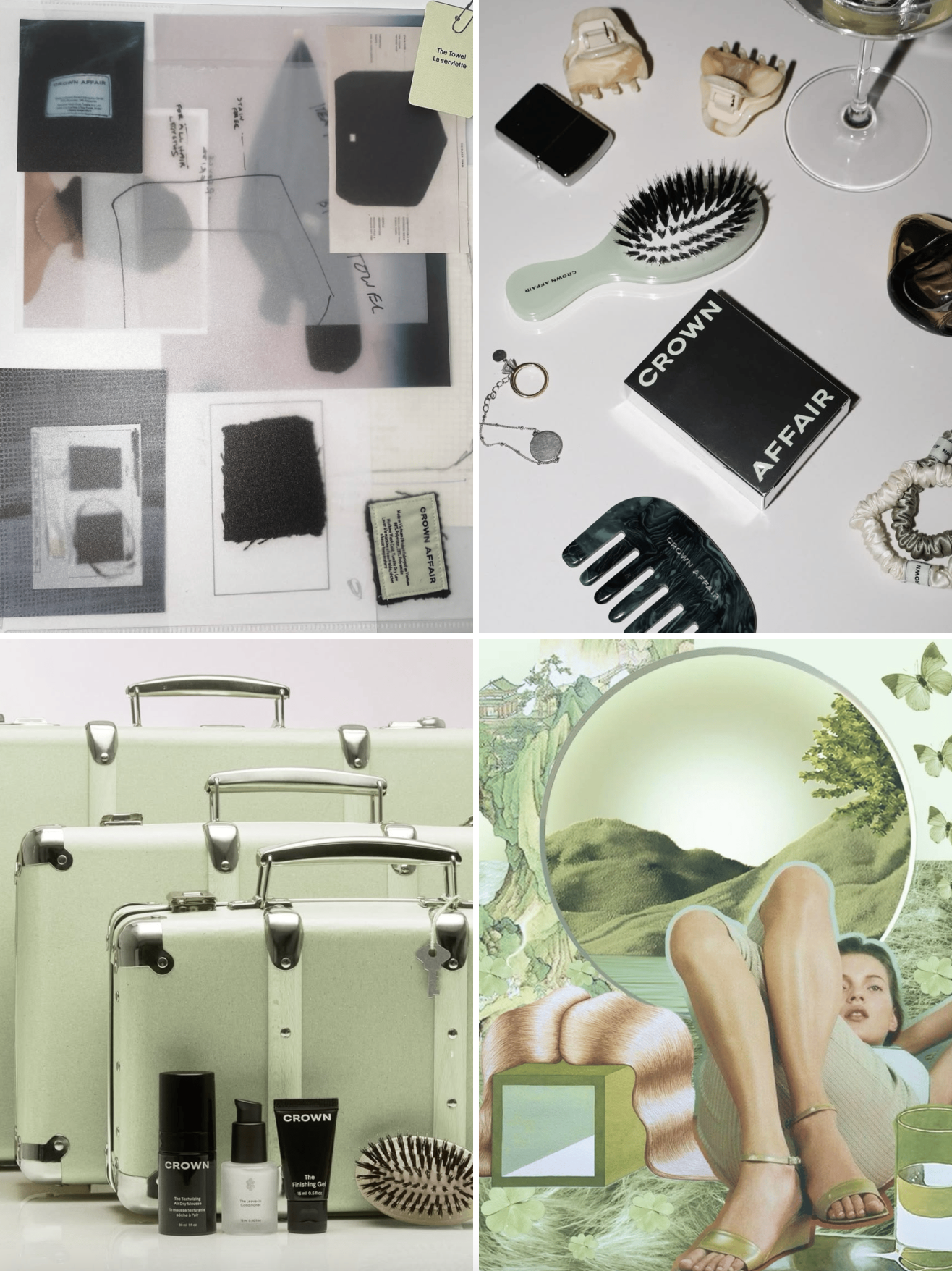
One brand I fucking love everything they do, design wise, and even with their marketing on Instagram, is Crown Affair, a haircare brand. I first came across them when I saw Jasmine Dowling had posted some content with them, and since then I've been keeping tabs on their brand and it's just so fucking good.
They use a single green colour that just feels really fresh and clean. 🌿💚🌱
Let’s talk about why this shit works, and why I think it's such a solid choice—brand recognition.
When you commit to using one colour across your entire brand, you’re not just making a “smart design decision”—you’re building a shortcut in people’s brains. 🧠 You're using the power of psychology before they even know it. It's a fast lane straight to you. Before they even clock your name or your logo, their brain’s already recognising it as your brand.
It’s instant. It’s powerful. And it’s subtle as hell. 👌
You're not out here throwing 50 different colours at people, letting them all fight for attention, you're letting one signature, intentionally chosen colour do all of the talking.
And over time that colour becomes your brand. 🙋♀️
When someone sees that green and thinks Crown Affair. Or that purple and thinks Cadbury. No logo needed. No tagline. Just pure, visual muscle memory.
And here's the other extremely important piece of making this decision—
You can’t just pick a random colour off a Pinterest moodboard, slap it on everything, and call it a day. If you’re gonna go all in on single-colour branding, that choice needs to come from deep strategy—not just aesthetics.
Because here’s the thing: once you start showing up consistently with one colour, you’re creating that recognition loop we just talked about. And if you change your mind 6 months in because “ugh it doesn’t feel right anymore,” you’re not just switching up the vibe—you’re breaking the fucking loop.
So you’ve got to get clear on your brand before you ever land on the colour.
🙋♀️ What does your brand actually stand for?
🌀 What energy are you bringing to the table?
🌿How do you want people to feel when they interact with your brand?
Calm? Bold? Luxe? Playful? Grounded? Fresh?
If you're going to go all-in on one colour branding, you can't half-ass it.
The goal isn’t just to make your brand look good now—it’s to build something that still feels like you in a year, two years, five.
And sure—you’re allowed to change your mind. You can use more than one colour. There are no hard rules here. But when you intentionally commit to one single colour and use it like a damn signature? That’s a bold, smart, high-impact design move. And when it’s done well—it’s honestly one of the coolest fucking things you can do with design. 😍
It’s not about limiting your creativity. It's about sharpening it, and making choices that fucking mean something. 😉