A free design case study: I pulled apart the Mejuri rebrand
A while back I started flagging design pieces or brands that I could do expanded case studies on, and there's one that got deep AF once I started diving in.
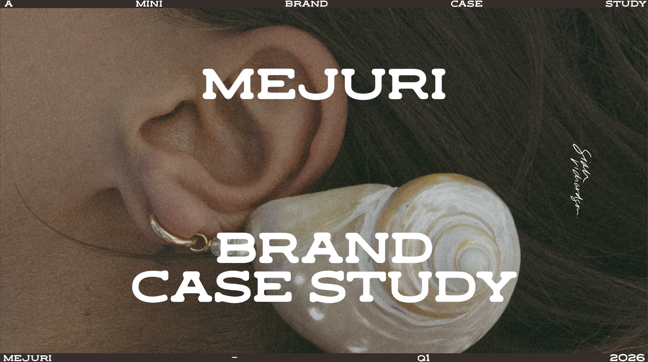
I’ve been pulling apart the Mejuri rebrand, not in a 'hot-take' way, more in a “what is this brand/design actually doing?” way, and I ended up turning it into a whole-ass case study video for you, totes for free.
Here's some of the shit I get into in the video:
🤔 why ultra-minimal branding works when you’re already huge, and why it’s risky as hell when you’re not
💬 where the design feels intentional vs where it starts to feel unfinished
🔥 how hierarchy quietly makes or breaks clarity
🌀 and the big one I always come back to: design has a job to do, and looking at where it's doing that job, and where it's falling flat
There’s a moment in this where I basically say, if you don’t decide what the job is, the layout just ends up… existing. And that’s where this rebrand loses me a bit—and where a lot of designers, and DIY-ers get stuck without realising it.
If you like nerdy, opinionated design thinking that isn’t about trends or vibes, you’ll probably dig this! It's not a workshop so you're not 'doing' anything, it's more of a 'watch and learn some inner workings of design thinking' kinda vibes.